EA (Electronic Arts)
Creating game states and simplifying the game tile system
Contributions
- Problem identification
- Application analysis
- Competitive analysis
- UX/UI design
Project Type
- Internship
- Individual project
Time
- 8 weeks
Tools
- Figma
- Miro
Overview
Introduction
EA is one of the largest gaming companies in the world, including games such as Apex Legends, The Sims 4, and It Takes Two. During my 4 month internship, I worked on the EA App, a PC platform for players to download and manage their games, as well as connect with other players across platforms.
Problem
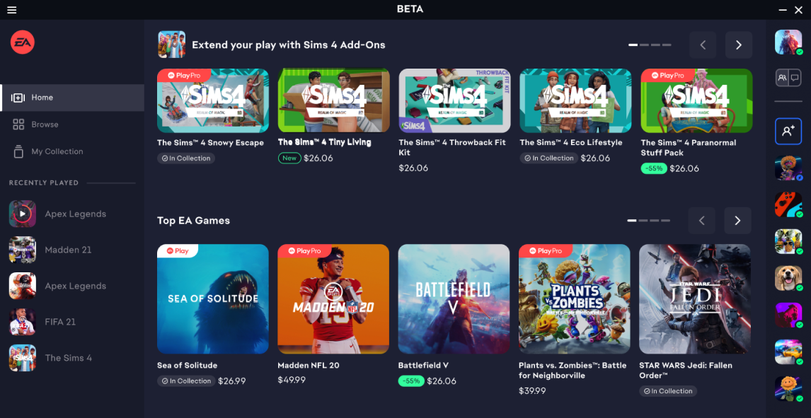
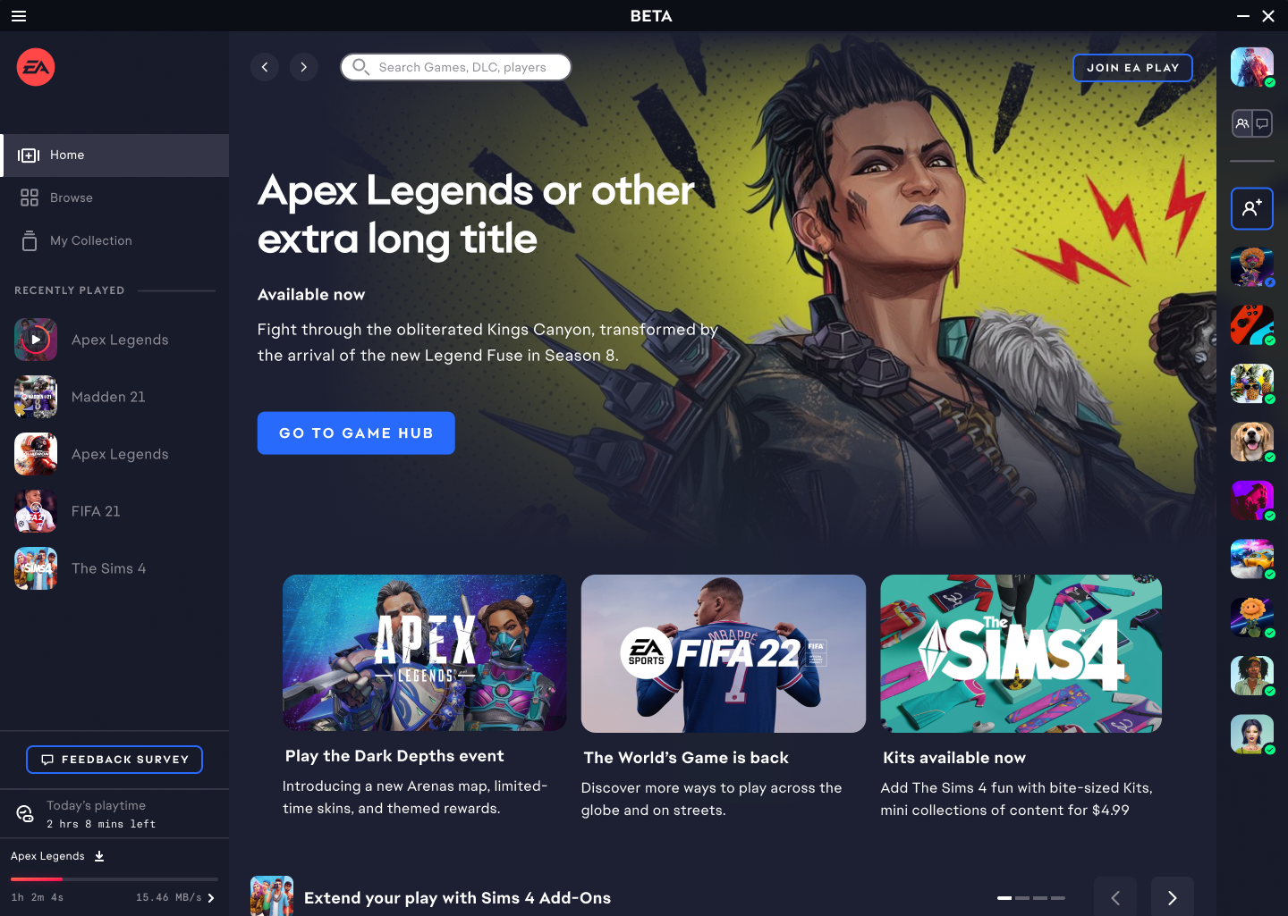
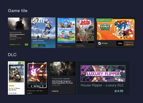
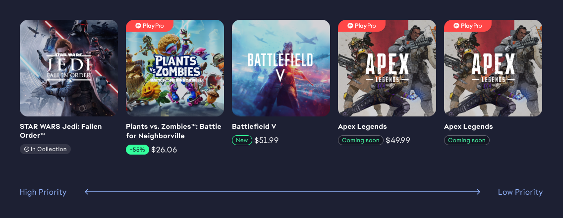
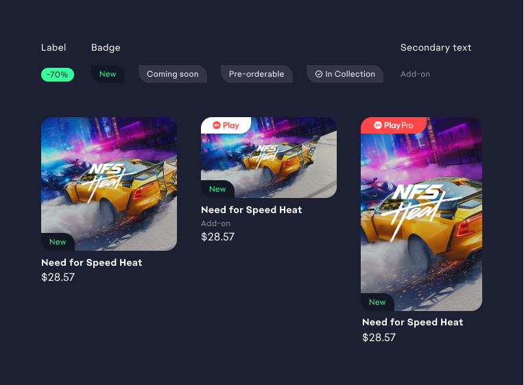
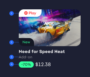
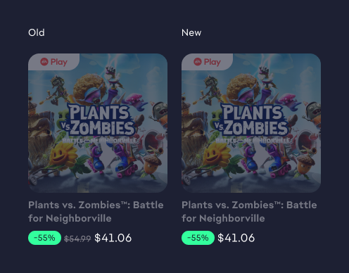
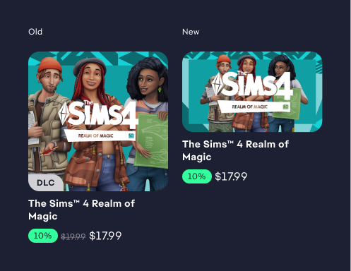
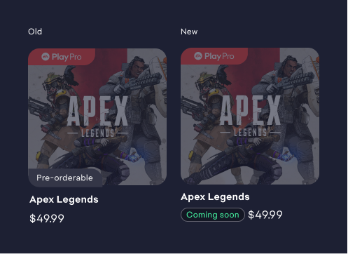
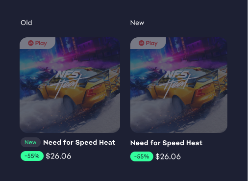
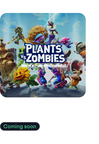
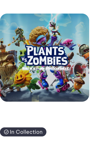
Game tiles are presented at the same level of importance in the discovery setting.
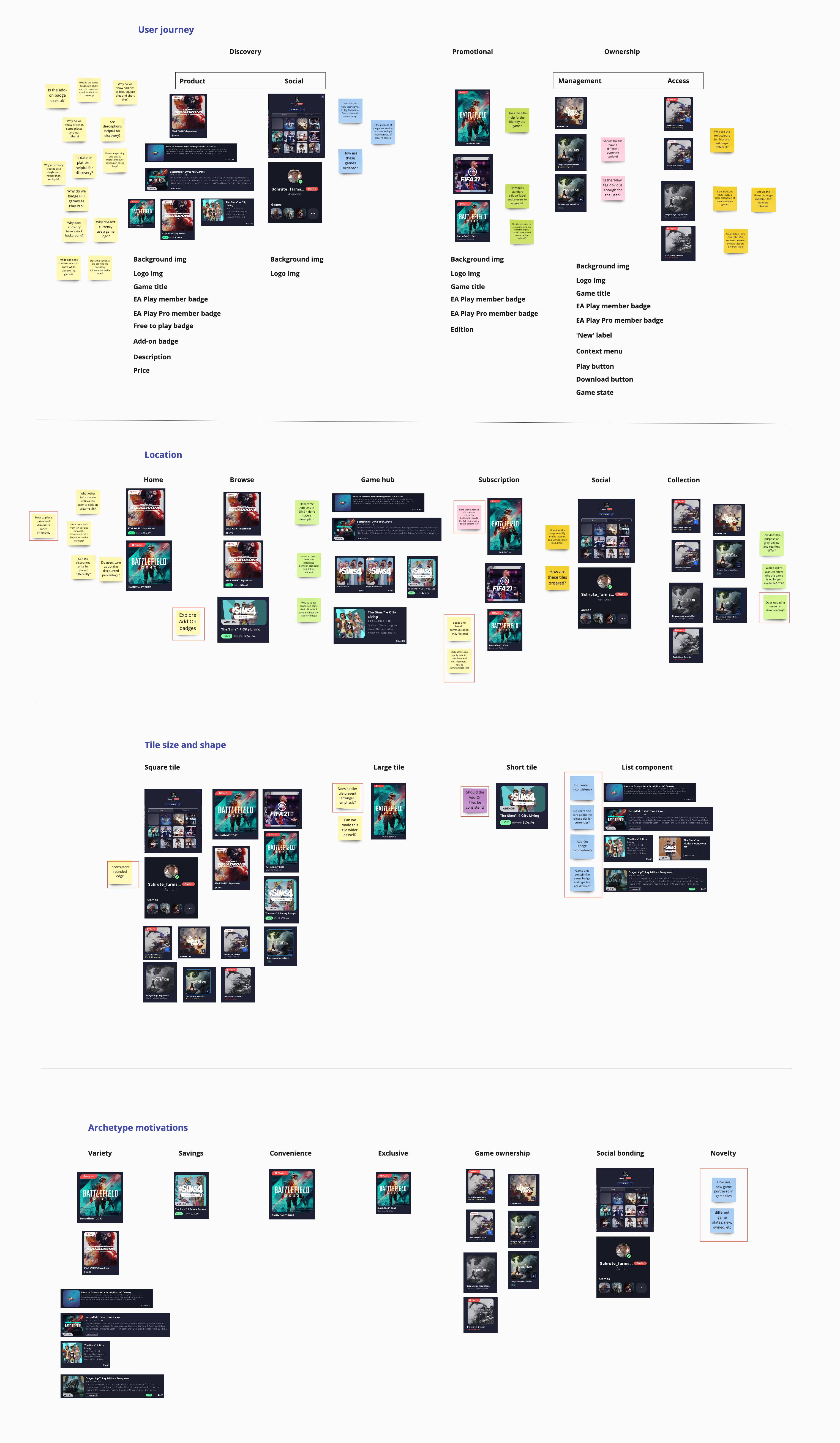
Problem Identification
Through user research, we identified that noveltiy is one the main motivators for game purchases. However, users cannot recognize the status of the game or their ownership to a game. This creates a design opportunity to draw increased attention to specific titles in a discovery setting.
Solution
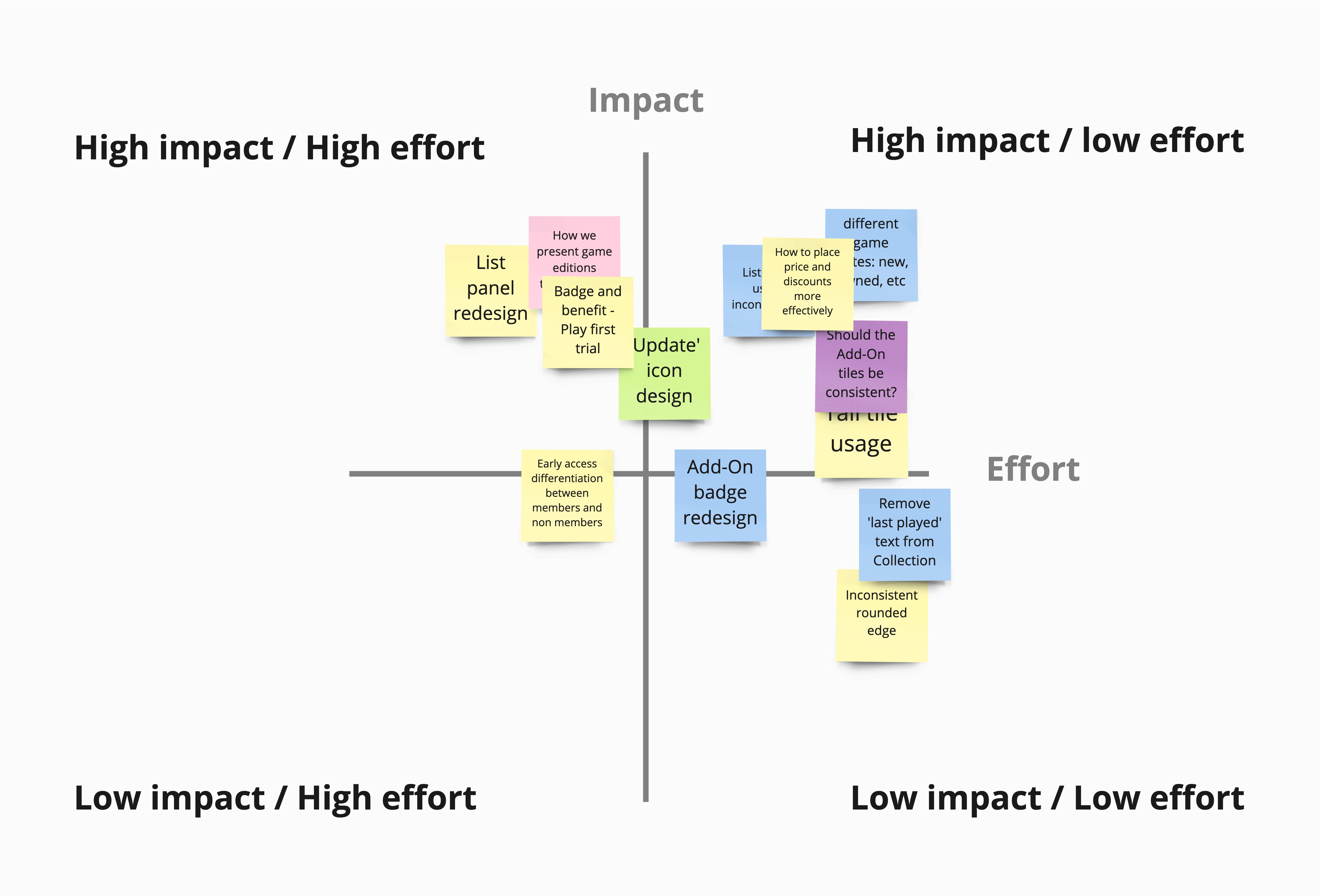
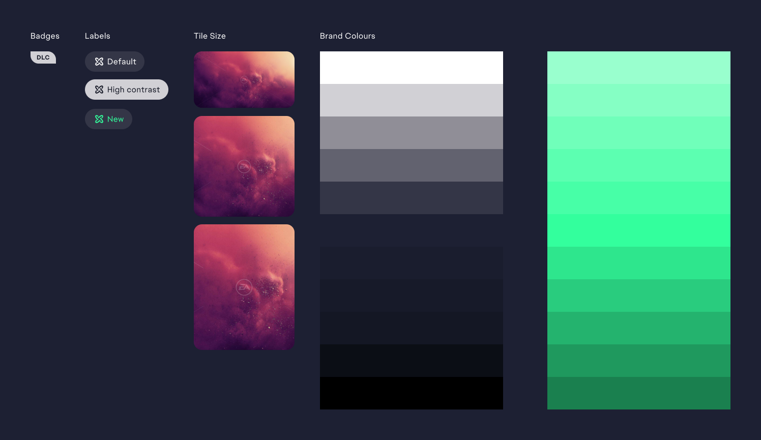
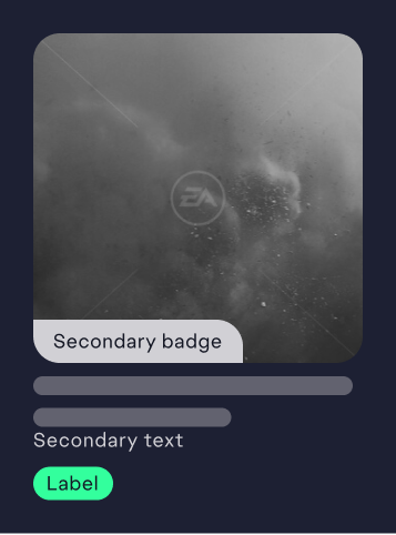
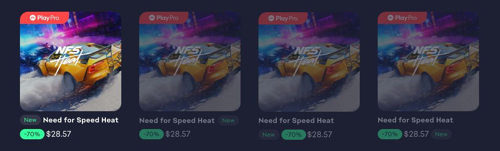
skip to solutionCreated new and improved game states to assist users in making purchasing decisions more quickly and efficiently.